Open topic with navigation
Get link | About Sage CRM editions
Adding a gauge chart to a sales report
User Requirement: Information Manager rights
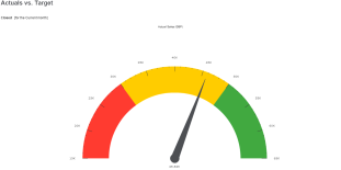
Before you can add a gauge chart to an Actual vs Target Sales report, you must set up a forecast. If you can't access the Forecasts tab, contact your system administrator. The gauge chart uses the target that you set in your forecast to create partitions. The partitions illustrate how your actual sales compare to your forecast target. Depending on how you've configured the chart, the first partition could indicate that you are very below target, the second partition could indicate that you are approaching your target, and the third partition could indicate that you've exceeded your target.
A gauge chart is also useful in a customer service report to show how you're performing against your SLA target.
- Set up a forecast.
- Click Reports | Sales and click the pencil icon in the Edit column beside Actual vs Target. The Report Options, Step 1 of 2 page is displayed. This report uses the default source view Sales Vs Forecast.
- Click Continue. The Search Criteria for Report page is displayed. Specify the duration on which you want to report.
- Click Continue. The Report Options, Step 2 of 2 page is displayed.
- Scroll to the Chart Options panel to configure the partitions in the gauge chart.
- Ensure Chart Style is set to Gauge.
- Choose the data that's used to set the gauge pointer in Value.
- Choose the data that's used to set the target value in Category.
-
Set the starting value of the first partition in Segment 1 Lower Limit %. This is a percentage of the target value. For example, if your target is 100%, you might set the lower limit to 33% so this partition indicates that you are very below target. Set the color of the first partition in Segment 1 Color and the name of the partition in Segment 1 Caption.
- Set the starting value of the second partition in Segment 2 Lower Limit %. This is a percentage of the target value. For example, if your target is 100%, you might start the second partition at 66% so this partition indicates that you are approaching your target. The end value of the second partition is your target value which is automatically taken from your forecast for the relevant period. Set the color of the second partition in Segment 2 Color and the name of the partition in Segment 2 Caption.
- Set the end value of the third partition in Segment 3 Upper Limit %. This is a percentage of the target value. For example, if your target is 100%, you might end the third partition at 133%. The starting value of the third partition is your target which is automatically taken from your forecast for the relevant period. So this partition indicates that you've exceeded your target. Set the color of the third partition in Segment 3 Color and the name of the partition in Segment 3 Caption.
- Click Save. To run the report and view the chart, click the arrow in the Run column beside Sales Vs Forecast.
To display charts in a PDF report, Adobe Flash must be installed on the Sage CRM server. Ask your System Administrator to install this software.
See Also:
Report fields and buttons
Chart styles
Adding report charts to a classic dashboard
Open topic with navigation


