Example
Stacked
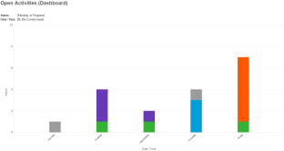
Bars are stacked on top of each other to display grouped data. It provides a wider view of data than a regular bar chart. A stacked chart is useful in an Open Activities activity report to show several actions that occurred on a particular day or date.
Gauge
Partitions on the chart indicate three ranges in relation to a target value; below, approaching, exceeded. The gauge needle indicates the current value. A gauge chart is useful in an Actual vs Target sales report to show how your actual sales compare to your forecasted sales for a particular period. You could also use a gauge chart in a customer service report to show how you're performing against your SLA target.
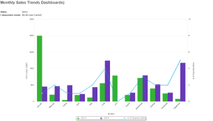
Combination
A bar chart indicates one set of data and a line chart indicates another set of data so you can get a wider view of results in one place. A combination chart is useful in a Monthly Sales Trends report to show information such as the revenue earned from sales and the number of sales that were closed in a particular period. You could also use a combination chart in a customer service report to show the number of cases opened compared to the number of cases closed in the system for the current year.